Plotting your data
There are currently two ways of plotting your data 1) basic time series plots and 2) statistical process control charts (SPC) (see Statistical process control for radiotherapy quality assurance).
Note
Anywhere you see a little chart icon (  ) next to a
test you can click on it to automatically be taken to a chart of that
data
) next to a
test you can click on it to automatically be taken to a chart of that
data
To access the chart interface choose the Charts menu item from the Review Data dropdown menu at the top of any page.
Charts option of the Trends and Analysis menu
The basic functionality of the charts page should be fairly self explanatory. First select the units you are interested in, and then select the test lists/tests you would like to plot data for.
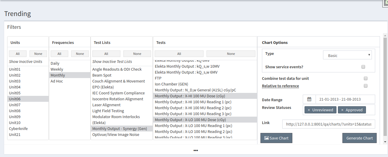
Choose tests to plot
There are a number of chart options which you can change:
- Combine test data for unit: Combine results for the same test from different test lists into a single series
- Plot relative to reference values If selected, the absolute difference is plotted for tests with absolute tolerances set or with reference values of zero, otherwise the percent difference is plotted.
- Show Service Events If checked, then charts will show markers along the x-axis for Service Events that occured on a Unit.
- Service Types Select the types of Service Events you want to show on the chart.
To create an SPC choose the Control Chart option from the Chart Options - Type: dropdown.
Once you are happy with the options, click the Generate Chart button.
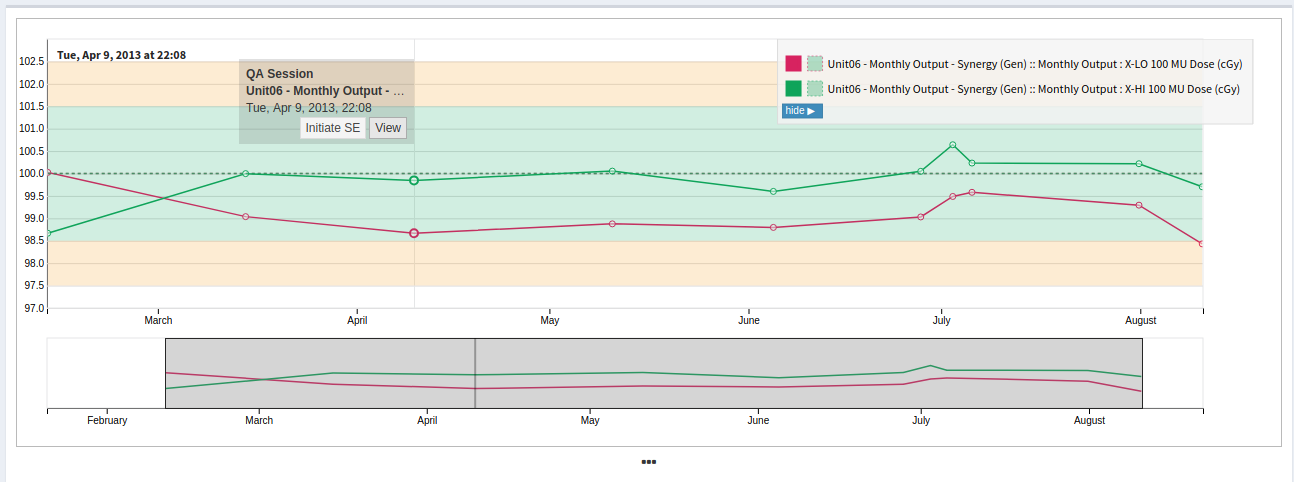
Time Series Plot
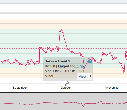
Time Series Plot showing a Service Event marker
The foo time series plots are interactive and you can pan/zoom the data using the sliders at the bottom of the chart.
In order to save a time series chart to an image, click the Save Chart button and a PNG image of the graph will be created.
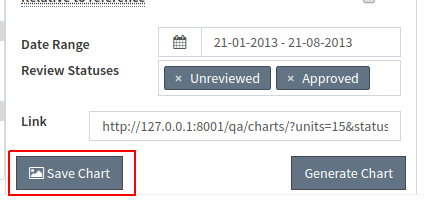
Save Chart
You can also use the URL located in the link text box under the chart to share the chart with other users.
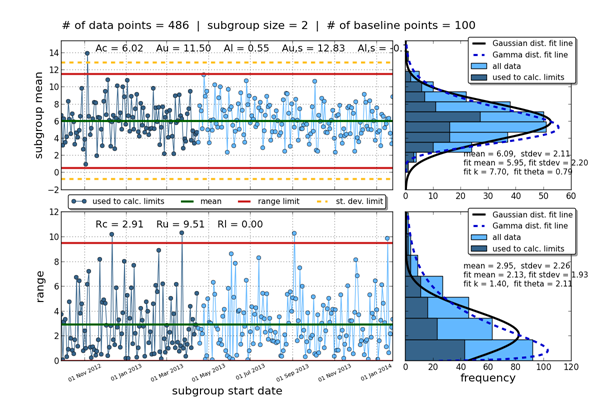
Control Chart
To save a control chart, right click and select Save Image As.
Notes on Control Charts
To specify where your baseline data comes from you can use the Date Filters under the Generate Chart button. For example if there was a reference change on 5 Nov 2012 then you would set the From: date filter to 5 Nov 2012 and the baseline points will be taken starting on that date.